

LINK TO INTERACTIVE PROTOTYPE
ABOUT
We were tasked to choose an educational tool to evaluate. I chose IUPUI’s University Library website, as upon my visiting, it was immediately painful to my eyes. It was also extremely cluttered.
PROBLEMS
-contrast too stark (vibrates; nauseating)
-too much information (crammed)
-needs more negative space
-redundant icon routes (some outdated landing pages)
-reorganize placement + layout (news + events)
-add section for popular actions (nested dropdowns)
-too much information (crammed)
-needs more negative space
-redundant icon routes (some outdated landing pages)
-reorganize placement + layout (news + events)
-add section for popular actions (nested dropdowns)


Usability Heuristics: Assessment
8. AESTHETIC and MINIMALIST DESIGN
This was the immediate first problem that jumps out to the user.
It was imperative that the redesign address this issue, and to assess any solutions with user testing.
It was imperative that the redesign address this issue, and to assess any solutions with user testing.
4. CONSISTENCY and STANDARDS
A few examples of poor practice were found: Common research tools were omitted from the Research dropdown menu. The search engine tool is not immediately intuitive of its multifunctioning use and capabilities. Search results landed as an endless scroll, rather than segmented or filtered searches.
3. USER CONTROL and FREEDOM
Some of the links would land on outdated pages, and/or within a landing space that wasn’t clear or optional on returning home or navigating elsewhere.
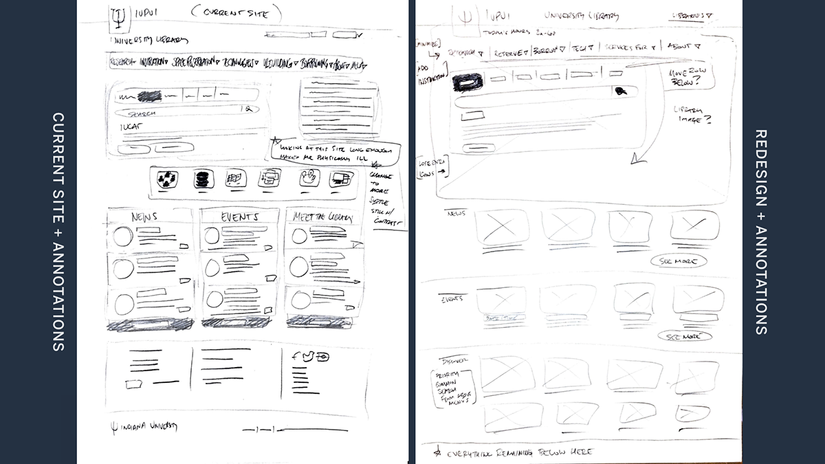
SKETCHES
USABILITY TESTING: CURRENT SITE
TASK 1
For a research paper, you are instructed to use the specific database Anthropology Plus (EBSCO) to find your source materials. Demonstrate how you may go about arriving to the Anthropology Plus (EBSCO) landing page.
OBSERVATION
Clicked “Research” dropdown first. Took a minute to locate the “Databases” tab in the multi-search box. Then typed in the search bar “EBSCO.” The search resulted in a very long list that the participant then scrolled down until he found the link.
PARTICIPANT COMMENTS
Wasn’t sure what to search for. “Should have searched for anthropology instead.” The search box seems weird and unusual, assumed a search would be at the top like what he’s used to.
TASK 2
Demonstrate how you might access the Herron School of Art Library
OBSERVATION
Took minute looking around, scrolled to bottom, scrolled back to top. Took another minute. Finally found a drop-down menu at the upper-right for “Other Libraries.” Found Herron Art Library.
PARTICIPANT COMMENTS
Was looking for a “Libraries” dropdown, with the bar containing all the other dropdown menus. “It should be here [with the other dropdowns].”
TASK 3
You want to make a reservation for a group study room. For planning purposes, you need to know the maximum duration permitted for your study session. Demonstrate how you might find this information.
OBSERVATION
Selected “Space Reservations” dropdown. Selected “Study Rooms.” Took a coule minutes on the study rooms landing page reading to find out the maximum duration permitted.
PARTICIPANT COMMENTS
Wasn’t sure what to search for. “Should have searched for anthropology instead.” The search box seems weird and unusual, assumed a search would be at the top like what he’s used to.
CHANGES NEEDED
While the search box may be unusual, it houses multiple search options, also allowing for the above dropdown menus. What would help: be more organized, and more importantly, use color and contrast to differentiate the elements, making the multi-search box tool conspicuous, legible, and intuitive.
Simplify “other libraries” to “Libraries” and add it to the bar with the other dropdown menu options.
Simplify “Space Reservations” title to “Reservations” dropdown. Maybe isolate and make more conspicuous the time limits permissions, instead of buried in body copy.
PAPER PROTOTYPE


USABILITY TESTING: PAPER PROTOTYPE
TASK 1
For a research paper, you are instructed to use the specific database Anthropology Plus (EBSCO) to find your source materials. Demonstrate how you may go about arriving to the Anthropology Plus (EBSCO) landing page.
OBSERVATION
“Typed” in search bar: “Anthropology EBSCO.” Selected link from results.
PARTICIPANT COMMENTS
“I would have used that dropdown last time, if it was there, but I didn’t see it…” Referring to the existing website testing, and after arriving to search result from simply “EBSCO.” Meaning, instead of scrolling down, he would have then used the dropdown for “Subjects.”
TASK 2
Demonstrate how you might access the Herron School of Art Library
OBSERVATION
Selected “Libraries” dropdown in dropdown bar section. Selected “Herron Art Library”
PARTICIPANT COMMENTS
“Boom [upon selecting Libraries dropdown].”
“Yeah, ‘Libraries’ menu should be here with the others.”
“That was easy.”
“Yeah, ‘Libraries’ menu should be here with the others.”
“That was easy.”
TASK 3
You want to make a reservation for a group study room. For planning purposes, you need to know the maximum duration permitted for your study session. Demonstrate how you might find this information.
OBSERVATION
Selected “Reservations” dropdown. Selected “Study Rooms.” Found time limit in body copy.”
PARTICIPANT COMMENTS
“Pretty straightforward.”
CHANGES NEEDED
Not much issue with the flow, conceptually. Just need to reorganize, minimize, and recolor, to optimize legibility and usability. (i.e., make the dropdown menus on the database search pages more legible and conspicuous).
Add “Libraries” to dropdown categories section
Isolate the time limit information from the body copy.
JOURNEYMAP

WIREFRAMES


WIREFRAME 1
Overall, added more breathing room, organization, and minimalism; along with more clarity & comprehensive legibilty throughout. There is a greater sense of “calm” that you would expect from a library, in contrast to the crammed, overwhelming, & physically disturbing original.
Top Moved title to banner. Hours upper left. Added a HOME link. Added LIBRARIES to dropdown categories. Intend to add Databases, Journals, and Article link to RESEARCH dropdown.
Search Engines Made search engines section more legible and intuitive. Intend to isolate the color of the activated menu category.
Margin Links Got rid of the card background to contrast the search engines more. Opened up the spacing.
News, Events, Staff Liberated them from their crammed environment. Even though they take up more real estate, they are much more legible and will be able to be skimmed and read faster, even as scrolling.
WIREFRAME 2
Search + Filters Added a search option so user doesn’t have to return home for search. The filter dropdowns are much more noticeable. Separated these elements from the results section, with the background.
Results Ten results appear at a time instead of infinte scrolling like the original. Much more breathing room with the results list. More contrast and hierarchy in the elements. “Full Details” — A moving button will slide down, revealing more details above it [toggle state will be “Close Details”].
Margin Links Added section for more research tools to further help the user.
LOW-FIDELITY PROTOTYPE
My lo-fi prototypes are a bit higher fidelity. This is because my problem space was less of an issue with flow, but rather more issues with aesthetics and organization. This pushed the prototypes to being higher fidelity than typical lo-fi.
SEARCH ENGINE TOOL
The visual cues of the Search Engines tool provides a more intuitive understanding of its functioning than what the original provides.


USABILITY TESTING: LOFI PROTOTYPE
TASK 1
For a research paper, you are instructed to use the specific database Anthropology Plus (EBSCO) to find your source materials. Demonstrate how you may go about arriving to the Anthropology Plus (EBSCO) landing page.
OBSERVATION
Each tester chose to use the search bar within the search engines application. They further explained the headings were clearly visible and indicative for supporting
user status.
user status.
TASK 2
Demonstrate how you might access the Herron School of Art Library
PARTICIPANT COMMENTS
“Super simple.”
“Easy to use.”
“Right there.”
“User friendly.”
“Easy to use.”
“Right there.”
“User friendly.”
TASK 3
You want to make a reservation for a group study room. For planning purposes, you need to know the maximum duration permitted for your study session. Demonstrate how you might find this information.
OBSERVATION
Selected Reserve dropdown, then“study room”— landing page, eyes immediately see the scheduling information
Each user expressed ease and comfort. Users preferred new prototype to existing website.
FINAL DESIGNS


CONCLUSIONS
Overal UI/UX Design Methods From the previous Prototyping for User Interface course to this one, I really value this entire process and see its effectiveness. I really appreciate Jakob’s 10 Usability Heuristics, and enjoy any “Aha” moments that come along—especially during the usablility testing stages.
The Site Study This website subject did not have many issues with flow or navigation, but had more issues with aesthetics and organization. If this were a real-life implementation, there would be much more research involved along with working alongside the library staff.
CHANGES
I’m not completely sold on my Databases by Subject landing page solution. So, I would explore that further. A more complex site like this, with a lot of offerings and resources, would take much more time and research to properly assess. But these solutions, for problems we did find in assessment, were greater improvements.
The user feedback, for the overall visual solutions, were all highly favored to the visual design of the currently active site.
LINK TO INTERACTIVE PROTOTYPE


